
.jpg?width=2048&height=1152&name=unnamed%20(1).jpg)
A common misconception in the B2B world is that your website isn’t all that important.
Many B2B companies invest heavily in launching their business, going in strong with branding, exhibiting at trade shows, growing their sales team, buying email lists, and maybe maintaining a social media presence. But when it comes to their website, it’s often treated as an afterthought, especially after a launch or relaunch.
In reality, your website can be one of your most valuable business assets. When designed strategically, B2B company websites can actively support lead generation, build trust with prospective customers, improve conversion rates, and contribute directly to revenue growth.
In this guide, we’ll cover B2B website design best practices and examples, explore what top-performing industry websites do well, and share practical tips for turning your website into a tool that helps your business grow.
What Makes a Great B2B Website: 10 Best Practices
When designing your B2B website, keep in mind that it serves a different purpose than a B2C website. Instead of comparing your site to consumer brands, cross-compare your website against successful industrial or tech companies in your industry. A strong B2B website strikes the right balance between user experience (UX), valuable content, and clear conversion paths that help turn visitors into leads.
|
Feature |
B2B Website |
B2C Website |
|
Audience |
Business, engineers, procurement teams, executives |
Individual consumers |
|
Buying Process |
Longer, involves multiple decision-makers |
Shorter, often one person makes the decision |
|
Primary Goal |
Generate qualified leads and sales conversations |
Drive immediate online purchases |
|
Content Focus |
Education resources, specifications, case studies, ROI |
Product features, lifestyle, conveniences, promotions |
|
Calls-to-Action |
Ask an engineer, schedule a demo, contact sales, download guide |
Buy now, add to cart, subscribe |
|
Trust Builders |
Certifications, customer testimonials, case studies, technical expertise |
Reviews, ratings, social proof, return policies |
|
Navigation |
Organized around industries, services, applications, resources |
Organized around product categories and collections |
|
Decision Factors |
Lead time, quality, compliance, cost savings, long-term value |
Price, style, convenience, availability |
|
Search Engine Optimization (SEO) Strategy |
Educational and solution-focused content that answers complex questions |
Product-focused and transactional keywords |
|
Success Metrics |
Leads generated, quote requests, form submission, pipeline growth |
Sales, brand awareness, average order value, conversion rate |
Below are the 10 B2B website best practices to keep in mind as you create your new site.
1. Lead With a Clear Value Proposition
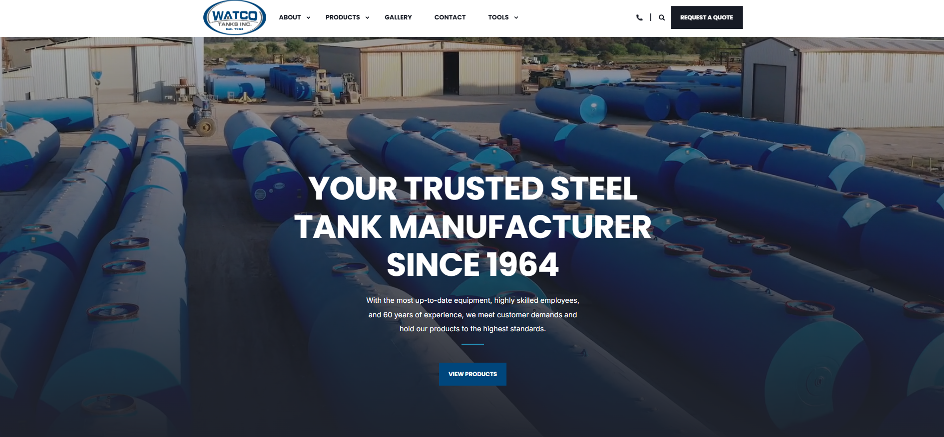
When a prospective customer visits your website for the first time, make sure they stay for as long as possible. They shouldn’t have to squint to figure out what you actually do or make. That should be clear within 10 seconds of landing on your website. Most users are going to rush through your website, so explain who you are quickly and “above the fold” (a term that’s a little nod to the newspaper industry, meaning it's visible to visitors without having to scroll)!
Example: Strong "hero" section
2. Design Around User Journeys
As you dive into your B2B website’s development, consider your buyer’s perspective. Consider the language they’ll understand and vibe with, and avoid any internal industry jargon that needs to be explained.
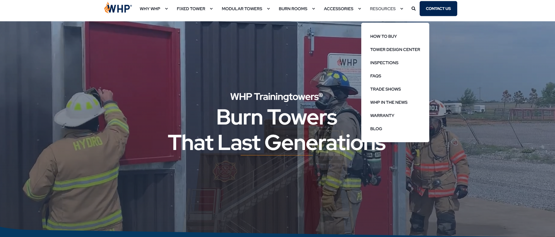
A B2B buyer’s journey goes from the Awareness stage to the Consideration stage, and then finally the Decision stage. Group your pages by user intent rather than by department-based menus. Simply put, structure the menus based on what the user is trying to achieve.
|
What the Buyer is Thinking |
Good Website Menu |
Poor Website Menu |
|
Help me understand this. |
Knowledge Center |
Marketing |
|
What are my options? |
Solutions |
Products Department |
|
Do you work with similar companies? |
Industries We Serve |
Engineering |
|
Can you prove it? |
Case Studies |
Projects |
|
I’m ready to talk. |
Request a Quote |
Sales |
|
I need help after purchase. |
Support & Contact Us |
Customer Service |
Example: Grouped by user intent
3. Make Conversion Opportunities Impossible to Miss
Make your calls-to-action (CTAs) impossible for users to miss. As the prospect moves through your website, keep these best practices in mind:
- Create highly visible buttons: Ensure the buttons pop with bold colors off the webpage background. Don’t make them blend in too much with your site’s main color motif, or they’ll fail to stand out.
- Use the 2-4 word rule: Keep button text concise, clear, and strong. Instead of “Click Here”, try “Start Your Free Trial.”
- Have thoughtful placement: Place primary CTAs above the fold, but also use sticky headers or footers to make it easy for the user to take action.
- Limit the options: Focus on one primary CTA per page to avoid decision fatigue and overwhelming the visitor.
- Keep contact forms short: Only ask for the information you absolutely need. If a contact form is too wordy, chances are the user won’t fill it out and leave the website.
Example: Call-to-Action Buttons

4. Build Trust Through Proof
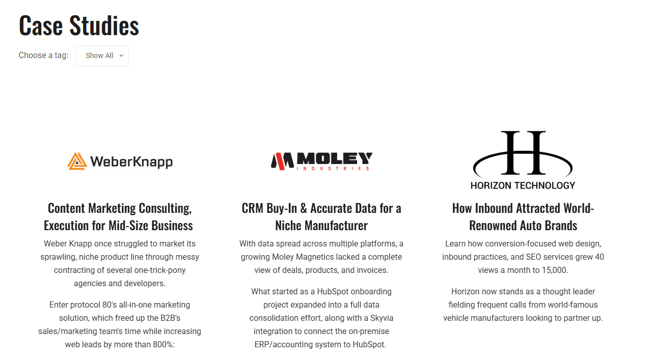
Think about the last time you were ready to buy something. What’s one of the first things you did? Chances are, you checked the reviews. In the B2B world, case studies and customer testimonials serve the same purpose. They provide real-world proof that you’ve solved similar challenges for other customers, helping build trust and giving buyers confidence that you can achieve real results.
To further build your credibility, highlight any certifications and industry awards your company has earned. Certifications show that your business meets recognized industry standards, while awards provide third-party recognition of your expertise and the quality of your work. Together, they help reassure potential buyers that they’re choosing a trusted, reputable partner.
Example: Case Studies webpage
5. Create Specific Content Hubs
As you think through the navigation structure and hierarchy of your website, bundle your content into groups. This organizes your digital presence by search content, making it easier for visitors to find what they’re looking for. Different structures include:
- Resource centers: Target informational search intent for visitors in the awareness stage. Content includes information such as whitepapers, webinars, guides, and blogs.
- Service pages: Dedicated to your company’s specific offerings, targeting visitors with high buying intent. Information includes case studies, ROI analysis, and direct CTAs.
- Industry pages: Create dedicated pages for top 3-6 or so industries you serve. Instead of using the same message across the board, speak directly to the unique challenges, goals, and terminology of each industry.
- Thought leadership: Share your expertise through articles, research, and insights about trends affecting your industry. Rather than simply promoting your products or services, provide valuable information that helps educate your visitors and build credibility.
Example: Industry Pages

6. Prioritize Mobile Performance
More than 60% of global web traffic now comes from mobile devices. The number might be slightly lower for B2Bs, but you’d better believe there are still plenty of industrial folks doing business on their tablet or phone. If your website isn’t easy to use on a phone, visitors are likely to leave before they find what they’re looking for.
A good mobile experience should include:
- Fast page load times
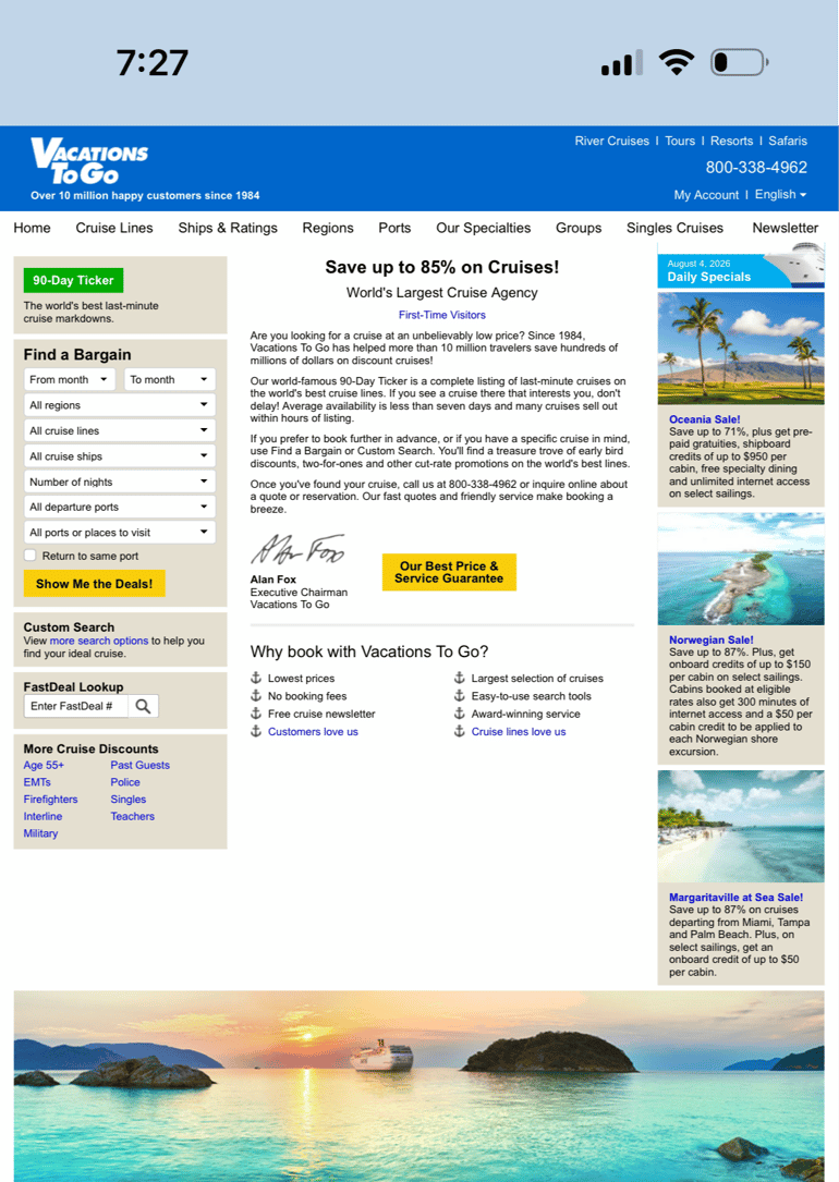
- A layout that automatically adjusts to fit any screen size
- Simple navigation with buttons and links that can easily be tapped on with a touchscreen
Example: The Vacations To Go website doesn't automatically adjust to different screen sizes, forcing users to zoom in to navigate and interact with the site
7. Invest in UX Before Bells & Whistles
Keeping your website simple doesn’t mean sacrificing expertise. In fact, a clean, easy-to-use website makes it better for visitors to find the information they need and keeps them engaged longer.
If users struggle to navigate your site, can’t quickly find what they’re looking for, or are interrupted by too many pop-ups or fancy effects, they’re likely to leave and continue their search elsewhere. Keep your visitors’ experience top of mind each step of the way.
Example: Well-organized homepage module that makes it easy for visitors to understand what the company offers at a glance.

8. Include an FAQ
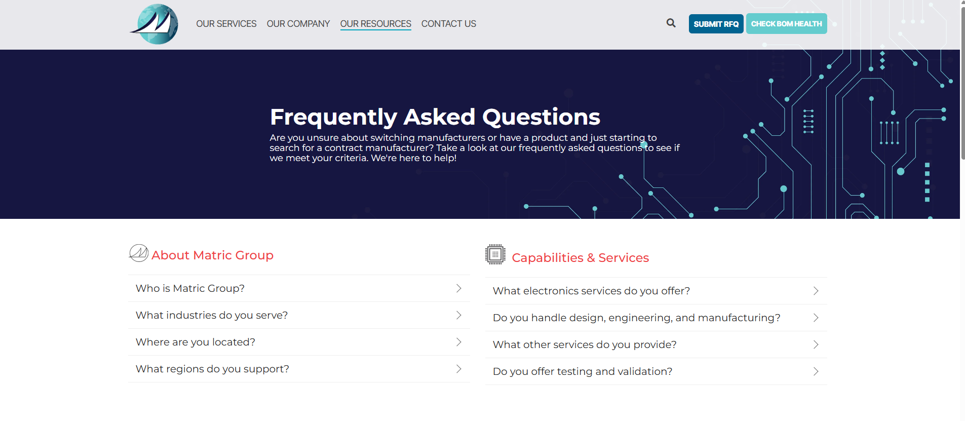
A frequently asked questions section is a simple and quick way for visitors to learn more about your products without having to reach out to customer support.
To create an FAQ section, think back to conversations you’ve shared with potential customers. Is there a common thread in each conversation? What seems to be one of the biggest challenges or concerns that continuously comes up? Those are the issues that need to be addressed in this section.
Example: A well-structured FAQ page with questions sorted by topic
9. Build SEO Into the Website From Day 1
Building SEO into your website from the start makes it easier for Google and AI-powered search tools to find, understand, and recommend your content. Researching the keywords and topics your ideal customers are searching for helps ensure your website stays relevant and appears in search results when it matters most.
Creating content without a clear strategy or ignoring audience search data can make it much harder for potential customers to find your website. Even the best-looking redesign won’t deliver results if no one can find it.
Bottom line: Think of your audience's POV and what keywords they will be putting into the search bar.
10. Think of Your Website as Part of Your Team
One of the biggest mistakes you can make is treating your website as a one-and-done project. Instead, think of it as an extension of your sales team. Just like your sales team stays up to date on new products, customers' needs, and industry trends, your website will need updated content, better user experiences, and ongoing optimization to keep it performing at its best.
As your website platform collects KPI data, review your analytics to better understand a typical user journey and where they convert or drop off. Use those insights to test different CTAs, forms, and page layouts to see what resonates best with your audience. Regularly update your content as well to keep information accurate, relevant, and aligned with your customers’ needs.
Signs It’s Time for a B2B Website Redesign
There are several signs that it may be time for a website redesign. Don’t ignore these warning signs – even small issues can have a big impact on your ability to generate leads.
- Low conversion rates: Visitors are coming to your site but aren’t filling out forms or taking any other next step
- High bounce rate: People are landing on your website but leaving quickly, which may mean your messaging isn’t meeting expectations
- Outdated branding: Your website no longer reflects your current voice, positioning, products, or level of expertise
- Poor mobile experience: If mobile visitors typically exit without action, visitors on phones or tablets must be struggling to navigate the site
- Difficult content management: Simple updates, like publishing a blog or editing a page, shouldn’t require a web developer every time
B2B Website Design: FAQs
Just as every business has its own frequently asked questions, website design comes with a few of its own. Here are some of the ones we hear the most:
Q1: What makes a good B2B website?- Within seconds, visitors should understand what you do, who you help, and why they should choose you. A good website builds trust and credibility, makes it easy to find answers to common questions and to contact you if more arise.
- Your website should be redesigned every 3 to 5 years to keep up with technology, customer expectations, and overall changes to your business. Of course, you’ll need to make smaller updates in between to keep SEO and user experience fresh.
- Make it easy for visitors to contact you with clear calls to action, simple forms, and easy-to-find contact information. Provide educational content that provides answers to common questions so that you show up in Google and AI search results.
- A simple, easy-to-use website creates a better experience and helps turn more visitors into customers. If users become frustrated on a site, they’ll quickly leave – even if you paid $15,000 for a flashy drone video of your facility.
- Detailed content helps search engines and AI understand what your business does, making it easier for prospective customers to find you online. Google can’t “read” images and thus can’t rank you solely on visual appeal.
- Yes, as long as the information on your website is helpful and well-organized.
- Every project is different, but on average, most B2B website redesigns take 3 to 6 months. The number of pages, integrations, and other technical features you have will influence this timeline.
Ready to Redesign Your B2B Website?
A website should help your company grow, not just look nice. The best B2B websites combine thoughtful design, a seamless user experience, search/AI engine optimization (SEO), and a strong conversion strategy to turn visitors into leads.
By following these B2B-specific best practices, you can transform your website from a static online brochure into one of your hardest-working sales and marketing tools.
Explore our B2B Website Strategy Guide and see how protocol 80 helps B2B companies create websites that attract, engage, and convert contacts.

How to Audit your Online Marketing
If you are executing digital marketing, congratulations! You are most likely already one step ahead of your competition, and making strides to meaningfully connect with prospects online. But, how do you know if you’re seeing continual success year over year, and improving your metrics?
Without the tools in place to analyze and benchmark your efforts, it is impossible to scale your online marketing and ensure continuous success.