If you are executing digital marketing, congratulations! You are most likely already one step ahead of your competition, and making strides to meaningfully connect with prospects online. But, how do you know if you’re seeing continual success year over year, and improving your metrics?
Without the tools in place to analyze and benchmark your efforts, it is impossible to scale your online marketing and ensure continuous success. In this guide, we’ll cover everything you need to audit your current efforts and give you the tools you need to move forward.

But First: A Note on Online Marketing Strategy
One of the biggest pitfalls that companies experience when embarking on a digital marketing journey is not creating a strategy. It is not enough to simply execute a smattering of tactics and hope that they produce results.
Companies that see success with online marketing carefully orchestrate a strategy that optimizes content and weaves multiple facets of content together to propel success.
The core elements of a good strategy that work together include:
- Website
- Social media
- Blogging
- CRO (Conversion Rate Optimization)
While each of these items are alone are great for digital marketing, together they make a powerful, well-rounded online marketing strategy.
In this guide, we’ll cover how to benchmark success in each of these 5 crucial elements of a good online marketing strategy as well as steps to find the data you need to benchmark your performance with each, platform and tool recommendations, and more.

Benchmarking Your Website Efforts
When checking up on the overall health of your website, here are some metrics to be mindful of:
- Traffic numbers
- Search engine rank
- Website impressions
- Click through rate
Each of these metrics has unique implications on the performance of your site, and coincide / affect one another when it comes to maintaining a healthy website.
Traffic
Put simply, traffic is the amount of visits (sometimes called sessions) to your website in any given period of time. Most often, traffic is measured by the amount of visits obtained in a month.
There are several sources of traffic, or ways that people find their way to your site. This includes:

- Social Media: When someone clicks a link to your site from a social media post.
- Email Marketing: When someone clicks a link to your site from an email that they received.
- Organic: When your website shows up in search engine results for any term or phrase, and a user clicks to your site.
- Referral: When someone clicks the link to your site from another site or source (ex: if your website was featured in an article on an industry site).
- Direct: This most commonly occurs when someone types your website domain directly into their browser.
- Paid: If you are running a paid ad campaign on a search engine or social media platform, the traffic you receive from those clicking to your site is tracked separately.
As you can see, there are unlimited possibilities for increasing your website traffic through digital means. Because of this, it’s crucial to have a fully fleshed out online marketing strategy to make sure that all traffic driving sources are strong.
Search Engine Rank
Rank is the place where your site appears in a search for a particular keyword. Because of this, individual pages of your site rank -- not the site as a whole. However, the more high ranking pages that you have on search engines for your business’ keywords, the more healthy your site will be overall.
For example, if you are a company that offers plastic injection molding services, you might want to rank for “plastic injection molding provider.” The higher you rank (or how close to the #1 spot) you are, the more traffic you will get.
Website Impressions
Impressions are the amount of times that a user has “seen” a link to a page on your site.
This could be as simple as your URL popping up in their search and the user scrolling by without interacting, or more in-depth such as a user pausing to read a featured snippet from your site that shows up for them on Google.
While this may not seem important, it shows how often your site is showing up -- which has implications regarding how many keywords you’re ranking for.
Click Through Rate
A click is the step that you hope a user will take after an impression. Click through rate is the amount of users who click a link over the total amount of users who saw the link.
For example, if your website shows up on page one of Google for the phrase “metal moulding manufacturer” and 100 people saw the link and 20 people clicked, you would have a 20% CTR.
Click through rate is an important indicator of how relevant your content is to the audience that is searching for the keyword that it is ranking for. If your click through rates are extremely low, that means that for some reason the page that is getting impressions but not clicks is not enticing enough for the user to want to explore further.
User Experience

User experience may seem like a big hazy cloud of data, but it’s actually pretty simple: How easy and enjoyable is your website to use?
A lot of factors contribute to user experience on the site, including:
- Navigation: How easy is it for a user to find the things that they need quickly?
- Aesthetic: Is your font easy to read? Are the colors pleasant and non-abrasive?
- Content: Is your content relevant to what they’re looking for? Can buyers answer their questions and move through their journey easily on your site?
These elements are difficult to objectively measure. Luckily, there are metrics that you can pull to help you read the minds of the users on your site:
- Bounce rate
- Session duration
- Page load time
Bounce Rate
Bounce rate is the amount of people who visit your site and then leave after viewing only their initial page of entry. Bounce rate can be calculated for any page on your site to help you diagnose what pages may be turning your visitors away.
One of the best ways to keep bounce rate from rising is to make sure your navigation is easy to access. This ensures that if the initial page of entry isn’t relevant to the visitor they can find one that is, rather than journeying to someone else’s site. Additionally, be mindful of carefully placing Calls to Action throughout your site to entice users to explore more and take the next step.
Session Duration
This metric is exactly what it sounds like: The amount of time that a user spent on a given page. Similar to bounce rate, this can be calculated for any page on your site, and is a good indicator of if your content is enticing or a snooze fest.
If you’re noticing, for example, that the average session duration on a 3,000 word blog post is 2 minutes -- that’s a safe indicator that your audience is not interested in reading that much content about that topic. Or, that might be a piece of content that’s worth offering for a PDF download so they can take it with them and return to it.
If all of your session duration metrics seem low, and your bounce rate overall seems high, this is a good sign that the pages are difficult to read or otherwise uninteresting to the audience.
Page Load Time
I bet you can guess what this metric is, too. The amount of time that your pages take to load is extremely important, especially on mobile.
The truth is that visitors are not going to stick around for too long to wait for your website to load, they’re simply going to try and find their answer somewhere else.
Some of the tools below will help you diagnose what is causing slow page load time, so you can work with your web development team to fix it.
Tools to Find These Metrics
To benchmark success using the metrics above, you’ll need some powerful tools behind you. Here are a few that our team uses and recommends:
- HubSpot
- Google Search Console
- Google Analytics
- Google PageSpeed Tools
- Website Grader (HubSpot Free Tool)
- SEMRush
- The native platform that hosts your website
One of the most effective ways to aggregate this data and begin to benchmark your success is by putting together monthly status reports. Sit with the members of your team involved (and those investing in your efforts!) and outline what the important KPIs are.
From there, you can begin to build reports using the metrics and benchmarks above, making note of any trends or outliers that occur. When you use this data to propel your strategy forward, your online marketing will reach new heights.
How to Exceed Your Benchmark Goals
Perhaps after pulling your first report you notice that your numbers are a bit lackluster compared to industry standards. The good news? Not all hope is lost!
Here are 3 easy, quick-win steps to take that should help improve the numbers you’re seeing:
- Produce content more frequently: If you’re rarely producing new, educational content on your site, your metrics will suffer. Think about it like this: without fresh material being produced, visitors have no reason to return to your site after their initial visit. From there, not only will traffic and rank suffer, but anyone returning to your site looking for new content and coming up short will be disappointed -- making for an awful user experience
- Run frequent site audits and fix issues in a timely manner: Check in on the data given by the tools above frequently, and fix problems as they arise. Building monthly reports is a great place to start. Make it a part of your routine to analyze your site and fix problems that may affect user experience or performance, pulling in your web development team when needed
- Solve for your buyer's problems: Picture this: According to your tools, your website is functioning healthily, you’re producing new content frequently, but your bounce rate is high and you are not seeing any increase in traffic. This is a good indicator that you might not be producing content that is relevant to your audience. The best way to figure out where to start when you’re beginning content production is to interview your customers. Find out what they would like to see from you, read more of in their industry, and what guides would have been helpful when they were in their buying process
Auditing and Benchmarking Your Email Efforts
Email marketing is one of the most popular facets of online marketing, especially in the manufacturing space. Chances are, your company has probably embarked on at least one mass email campaign in the past. But how are you benchmarking your success?
A lot of companies fall into the trap of simply looking at the industry benchmarks for open rate and think that if they are constantly sending emails that perform higher than average, they are doing fine. But the truth is, open rate is only one of 5 important metrics to look at when auditing the overall health of your email marketing.
Moreover, these metrics have different implications and fall into two distinct categories when measuring success: engagement and list / CRM health. If you are only looking at engagement metrics, you are failing to diagnose and troubleshoot issues that are plaguing your CRM, and ultimately may damage your engagement success.
Email Engagement Metrics
There are two simple ways to measure how your audience has engaged with your marketing emails:
- Opens
- Clicks
However, within both of these metrics is the ability to get more granular with the data to draw more specific and distinct conclusions.
Opens
Measuring email opens is done in two ways: the number of people who opened your email, and the email open rate. Open rate is calculated by taking the number of people who opened your email out of the number of people it was sent to.
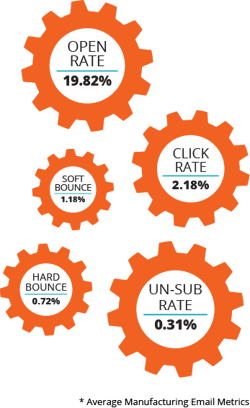
The average email open rate for manufacturing companies is 19.82%. But, be careful not to fall into the trap of thinking that just because your open rates are 20% or higher that you are doing as much as you can to take advantage of email.
In truth, there are a number of factors that affect open rate, and could skew results. This includes:
- List size: The smaller your list, the higher your open rate is likely to be. Keep in mind that if you’re measuring your results against the average benchmark, then you must have at least 1,000 subscribers in your database for the results to be comparable.
- Email provider functions: Be careful of putting all your eggs in the open rate basket because the results may not be entirely truthful. Most email providers have a function that allows you to mass-mark emails as read, or opened, even if the user themselves has never so much as glanced at the content inside. This doesn’t mean that you should disregard open rate entirely, but is a gentle reminder that a high open rate and high open rate alone does not necessarily indicate an interested list.
Clicks
Similar to opens, clicks are also delivered in a few ways:
- Click rate: The amount of people who clicked a link in your email out of the total amount of people the email was sent to. The average click rate for manufacturing companies is 2.18%.
- Click through rate: The amount of people who clicked a link in your email out of the number of people who opened your email.
- Unique clicks: The amount of people who clicked 1 link in your email.
- Total clicks: The amount of people who clicked 1 or more links in your email, aggregating the total amount of times they clicked. One person who clicks 3 links counts as 1 unique click and 3 total clicks.
Most digital marketers are most concerned about the click through rate metric, as that indicates the interest level and retention rate of the email once it was opened. Since it would be impossible for someone to click a link in an email if they didn’t open it, click rate is a better metric to plot over time, rather than look at on an individual email basis.
List / CRM Health Metrics
So, you’ve got killer open rates and click through rates -- but those aren’t the only marketing metrics to be mindful of. There is a lot more info you can, and should, glean from your marketing email sends by taking a look at:
- Bounces
- Delivered
- Unsubscribes
These metrics, rather than tell you how your email performed with the audience that received it, will tell you about those who didn’t receive it, or worse, received it and wished they hadn’t.
Bounces
For an email to “bounce” it means that it did not reach its intended recipient’s inbox, and was somehow blocked or “bounced” away. There are two ways that emails can bounce:
- Soft bounce: When an email is reported as having soft bounced, it means that it could not be delivered for an impermanent reason such as their inbox being full or needing an update to receive your message. Monitor your soft bounces to see if the same contacts are appearing over and over again.
- Hard bounce: When an email hard bounces, it means the delivery has failed for a permanent, unchangeable reason such as the domain or email address no longer existing. It is wise to delete these contacts, as there is no chance of a successful email ever being sent to them.
The average manufacturing email hard bounce rate is 0.72% and the average soft bounce rate is 1.18%.
If you are seeing a high number of bounces with your emails, it’s a good indication that your email marketing list may not be in good shape. Ensure that your sales team is acquiring the correct emails that do not have any typos, or are entirely fake, resulting in a hard bounce.
Delivered
When looking at the data from your email sends, you’ll see a number for “sent” as well as “delivered.” Although the goal is for these two numbers to be exactly the same, oftentimes they are not.
This discrepancy can be due to a hard bounded email that was not delivered, or because you’re attempting to message someone without the right permissions and consent. If they have not opted into email, for example, the message will not deliver to them despite the fact their address was typed in to send.
Unsubscribes
Finally, the dreaded email metric no one wants to see: unsubscribes. You guessed it -- this is the amount of people who clicked the unsubscribe button on your email, and who you will no longer be able to message via email.
Unsubscribes can happen if you’re messaging your audience too frequently with content that they are uninterested in, or perceive as spammy (some email providers have a separate spam report function for this). The tricky thing about unsubscribes, however, is not all unsubscribes are a bad thing. In fact, a certain amount of unsubscribes indicate a healthy list.
Here are some scenarios where someone may unsubscribe, and it’s not necessarily a red flag about your email quality:
- If they downloaded something on your site for research purposes, and are not actually interested or qualified to buy your products or services.
- If they have been through the sales process with your company and it was deemed that you are not a good fit, and never could be. There’s no need to have this contact cluttering up your lists.
- If they are a longtime customer of yours. If you’re sharing high-level educational info with your audience, this might be awesome for a company who is thinking about partnering with you or is still being introduced to you. However, your longtime customers may not deem the info necessary, and that’s okay!
Because there are some valid reasons for an unsubscribe that should not cause panic, there’s no need to shoot for a 0.00% unsubscribe rate. In fact, the manufacturing industry average is 0.31%.
A handy way to audit your email portal and tell whether your unsubscribes are healthy or unhealthy is to take a look at the list of people who unsubscribed. Are they largely personal emails? Are they customers or competitors? Are they outside of your service area? If so, it’s probably okay.
If it looks like a lot of companies that could be potential good leads are making the list, however, it might be time to seriously take a look at your email strategy, and consider how to make them more relevant (another great place for buyer interviews!).
How to Find These Metrics
Most email marketing platforms should have these metrics readily available whenever you click on a past email that was sent.
Some of the platforms we recommend using are:
How to Improve Your Goals

If your metrics are falling flat of the benchmarks you would like to see, try out these tips:
- Be bold, change up your strategy. If you are sending the same email, with the same subject line, in the same template, on the same day, at the same time, every month there’s a really good chance your audience is going to get bored and your click and open rates will plummet while your unsubscribe rate soars. Change up the look and feel of your subject lines, link and CTA placement, time and day of send -- and record the results.
- Test, tweak, test, tweak, perfect. Be sure to take advantage of tools like A/B testing to find out
what works best for your audience. Is there a specific day that works best? Do subject lines with questions yield higher open rates? - Send only as often as you can be helpful. This is the #1 tip for getting your metrics to where you’d like them to be. If you are sending helpful content to your audience ONLY at the frequency where you can be helpful (without forcing it) your engagement will increase.
Auditing Social Media Performance
Social media has become a crucial part of digital marketing, and doesn’t appear to be going anywhere anytime soon. Similar to email marketing, most
However, we see many companies making similar mistakes when it comes to social, and falling into bad practices:manufacturing companies have dabbled with incorporating social media into their digital marketing strategy.
- No two platforms are the same. It’s important to understand that audiences, metrics, tone, algorithms, and more
 vary from platform to platform. If you’re treating every platform as the same, and not doing research into how to best serve the audience uniquely on each, your social media efforts will always fall short.
 - You don’t need to be on every platform. Don’t waste your time posting on Twitter every single day if your buyers never visit Twitter to look at industry information. Focus on the platforms you know your buyers are on, and master those.
- Do not post only first party content. This can be perceived as spammy or overly sales-y, and isn’t helpful to your audience. Post only as frequently as you can be sharing helpful, educational resources -- and don’t be afraid to share third party articles from trusted industry thought leaders and publications.
Now that we have some of the ground rules covered, let’s hop into metrics. Remember: Each channel has individual considerations when it comes to metrics. However, every metric mentioned below should be relevant on all channels, and serve as a good place to start when it comes to auditing the social aspect of your digital marketing.
Social Engagement Metrics
Engagement metrics for social are different from email engagement metrics in a lot of ways, but similar in what they measure -- how much your audience is interested in your content.
The four main metrics to be mindful of are:
- Likes
- Comments
- Shares
- Clicks
Measuring engagement is not only important for knowing how well your content resonates with your audience, but the algorithms will give preference to your future content based on your page’s historical track record with engagement rate.
When you are repeatedly posting on a platform and few to nobody is interacting with it, the platform will start to perceive your content as spammy and show it less in the feed. Avoid this by keeping a careful eye on key metrics, and tweaking based on what the numbers are showing you.

Likes
Recently, both Facebook and LinkedIn have changed the simple “like” function to reflect a wider array of emotions. As far as engagement is concerned, all of these “reactions” are considered equal.
However, when it comes to comparing the “like” function of engagement against other methods of measuring engagement, “likes” are the lowest on the list in terms of indicating how interested people are in your content. It requires little to no effort to push the “like” button when viewing content, thus making the barometer of engagement lower than some of the other actions taken by your audience.50 “likes” on a post is still better than 10, or none -- but 50 comments would be preferable.
With that being said, “likes” are still an extremely valuable function of engagement, and are not entirely worthless. When it comes to social proof, or the idea that your audience will want to engage with something because others have, “likes” are extremely valuable.
Comments
Comments (or a reply on Twitter) are a more intimate means of engagement, and preferred by both social media managers and algorithms alike. It can be extremely difficult to entice people to comment, since it requires substantial effort by the audience. This is why it is important to share information that your audience would be interested in engaging in.
Practice asking questions based on the educational material you’re sharing, and create an environment on your platforms that is known for fostering industry-related conversation.
Shares
Shares (or a retweet on Twitter) are the golden metric of engagement on social. Not only do shares indicate that your audience is so interested in
your content they want to share it with their network, shares also increase your reach and impressions. We’ll get into the value of that more in brand awareness metrics.
Similar to comments, shares are more likely to occur when the content that you are putting out is genuinely helpful to your audience. The goal is for someone to read it, think “Wow this was really helpful!”, and want to share that really helpful info with someone else, fostering the same halo experience that they feel for you.
If you’re seeing a low number of shares on your post, test out including some language that would prompt people to want to share.
For example, if your company just published a timely article about tariffs and how they’re going to affect the industry you’re in, that may be a good place to share on social with language such as “Share with your connections as a helpful FYI.”
Clicks
Clicks measure the amount of times your audience has clicked a link in your post on social. This is not a measure of engagement that the public can see (unlike the other metrics) so it will not help with social proof.
Most importantly, clicks help tell you the content that your audience is most interested in interacting with, and help you tailor your social strategy to reflect this content.
If your clicks are suffering, here are some things you can try:
- Try using language that acts as a CTA. For example, “Click below to learn more about [topic].”
- Experiment with emojis that call attention to the link. A favorite of ours is using the 👇 emoji.
- Test out what text length works best for your audience. Depending on your persona, they may prefer to read a paragraph that describes the link, or just a few words.
If you’re noticing that third-party links are getting more clicks than first-party, it might be time to start to change up your content strategy to match what industry experts and publications are talking about, to meet your audience’s interests.
Brand Awareness Metrics
Luckily, on social media, there are a few ways to measure brand awareness, and set KPIs accordingly:Brand awareness is one of the most slippery elements of digital marketing to benchmark, yet one of the most commonly tossed around “goals.”
- Reach
- Impressions
The longer that you’re on social media, the more you want to see these numbers increase.
Reach
Reach is the metric that indicates the amount of unique people who see your content. In a perfect world, your reach would be the same as the amount of followers that your page has. Unfortunately, as organic posts on social slowly fade while paid posts take preference on the platforms, this rarely (if at all) happens.
One way to increase reach is to obtain more engagement. Put simply, the more times your audience consistently interacts with your posts, the more the platform’s algorithm is going to show it to people. Comments and “likes” affect reach in this way.
Shares, on the other hand, directly impact reach. If a follower of your page shares their post with their audience, your reach increases by the number of people in their audience who see that post.
Additionally, investing in paid to boost your organic posts results in increased reach to an audience of your choosing. This is a “quick fix” for expanding reach, but also can be a costly one if you begin relying on it too heavily. Work to improve your organic post engagement and use paid strategically. Together these tactics will improve your reach.
Impressions
Impressions, while extremely similar to reach, is the amount of time total that your content is displayed. This means that your impressions could be identical to reach, but most likely is slightly higher due to your content showing up in someone’s feeds more than once.
The tactics taken to increase impressions are the same as reach.
How to Find These Metrics
Here are a few places to find these metrics:
- On the tools: The reporting tools that are natively on the platform are the best resource you have. They will give you all of the above metrics, and even dive a little deeper into some of them.
- HubSpot: Using a tool like HubSpot will not only help you measure the above metrics, but can help measure traffic that comes to your site or blog from social. This is an advanced way to look at clicks as a whole, rather than at each link. Additionally, you are able to schedule and manage your social posts on multiple platforms using their tools.
- Hootsuite: Hootsuite allows you to schedule posts in advance on multiple platforms, and keeps all your feeds in one place for easy engagement. If your company is focusing efforts across multiple social platforms, Hootsuite can help.
How to Improve Your Goals
If you’re not growing your page and increasing engagement as quickly and steadily as you would like, here’s a couple things you can try:
- Experiment with times and days for posting. If you’re feeling confident that your content should be helpful and interesting to your audience, but the metrics are not reflecting that, there’s a chance you’re simply posting when they’re not online. Take time to run experiments posting at different times and different days to figure out when is ideal.
- Monitor what others are doing. You want to stand out on social and not copy content, but don’t waste time trying to reinvent the wheel. Especially if your page is new, it’s important to join conversations with topics that are already working. Once you build engagement, then start to try something new.
- Interview your customers. This isn’t the first time we’ve mentioned it in this guide, but we cannot emphasize enough how helpful it is. Ask them about their habits, what platforms they’re on, what they do and do not like to see on social, when they browse, what gets them to interact, etc. Once you start posting, ask a trusted customer to give you feedback on your performance so far, and tweak accordingly.
Auditing Your Blog
One giant aspect of blogging is making data-driven decisions for future content based on past performance. While producing new content frequently is fantastic, if you’re never circling back and seeing how each blog post performed, you’ll never be able to mimic your success or course correct any failures.
Auditing your blog is similar to your website, so some of these benchmarks may seem familiar. However, there are unique considerations for how your blog performs both with your audience and with search engines that are worth noting and monitoring.
(Haven’t started blogging yet? Check out this video from our content writers, Adam and Holly, discussing blog post ideas, where to find them, and how to get started.)

Blog Engagement Metrics
Chances are if you’ve been producing content strategies and blogging for some time, you’ve probably at least taken a look at the views on your posts.
The good news? This is definitely a metric you want to be looking at.
The bad news? If this is the ONLY metric you’re looking at, you’re missing out on three crucial others:
- Views
- Top performing posts
- Time spent on page
- Bounce rate / Exit rate
Similar to website, your engagement metrics do have an effect on your search engine metrics (to be discussed below).
Views
Post views, sometimes called sessions, are the amount of times that someone has visited the post. Views can be tracked for all time, or for a set time period (quarter, month, week, day).
If you are just starting out blogging, chances are your views right off the bat will be pretty low. A little bit later on, we’ll discuss the various sources for each view, and how you can increase them.
Top Performing Posts
On your native platform, or on a tool like HubSpot, you should be able to see what posts “top performing.” You can set the benchmarks for “top performing” based on what is most important to you: views, bounce rate, time on page, new contacts generated, etc.
It’s important to keep an eye on top performing posts month over month to ensure that no posts are “falling off.” If you have a post that has been steadily increasing in views and then randomly declines, it might be time to consider re-optimizing this post with updated info, or writing a supporting piece of content with the same keyword(s).
Additionally, top performing posts are a good way to determine future premium content opportunities. If you have posts that are consistently generating views, putting a relevant conversion opportunity on these posts to capture leads is a great strategy.
Moreover, these post topics can help inform future blog post ideas to align with a future premium piece of content like a Pillar Page.
Time Spent on Page
Closely monitor the time spent on page for your top performing blog posts, as well as your blog posts overall. If you know your blog post takes 5+ minutes to read, but the average visitor is only spending 120 seconds on the page, it might be time to revisit the content and diagnose what is deterring readers from spending more time reading.
Some common reasons could be:
- There is too much text. Try breaking the text up with infographics and relevant images so the post does not seem so daunting. Additionally, utilize bullet points when possible to increase readability.
- The topic does not solve for the keyword and title. If your content is not solving the problem or answering the question that the reader was searching for when they came across your blog, they’re going to pick up on that early and look for another source.
Bounce Rate / Exit Rate
As we discussed previously, bounce rate is the amount of people who visit your site and then leave after viewing only their initial page of entry. Exit rate, on the other hand, is the amount of people who viewed the specific page in question as their final page.
Here’s what this looks like in practice:
When a person types a keyword into Google, clicks your blog post, spends a few minutes on your page, and then immediately leaves your site, this person has contributed to bounce rate on that blog post.
When a person types a keyword into Google, clicks your blog post, visits 3 more blog posts, a website page, and then one final blog post, this person has contributed to exit rate on their final page viewed.
Bounce rate is an indication that the piece of content in question does not adequately set up visitors to move through their journey, or is otherwise uninteresting.
Exit rate, on the other hand, is only an indicator of poor performance when it is on an awareness state blog post. Meaning, you had hoped that this blog would be the first of many touch points for a visitor, and that they would move elsewhere before leaving. When your exit rate is high on a decision stage blog post or an RFQ page, this makes sense, as you have answered the visitor’s questions and moved them along.
Improving both rates is similar, and fairly simple. Again, make sure the content in question is reasonably answering for the plausible intent behind the search query it appears on (or the keyword it ranks for). Additionally, make sure your content points to other relevant content that the viewer would be interested in.
Blog Search Engine Metrics
Here’s what to keep an eye on when it comes to how your blog is performing on search:
- Traffic source
- Clicks and impressions
Traffic Source
We discussed traffic source when talking about websites, and the sources for blog traffic are the same:
- Social media
- Email marketing
- Organic
- Referral
- Direct
- Paid
However, in the context of blog and search engine, we’re going to be focusing on organic traffic. As a quick refresher, organic traffic is the amount of visitors to your blog after typing in a query on a search engine, and clicking your blog link that appears. The higher your blog link appears (your rank), the more clicks you will get. The more terms or queries (keywords) that you rank highly for, the more blog post will appear, the more traffic overall to your blog.
When you first begin blogging, your organic traffic will be pretty low. This is to be expected, and happens to almost everyone, as the search engine is just getting introduced to your website, your content, and is busy gauging how helpful you will be to those searching for the topics you write about.
This is when other traffic sources can help supplement and support your content, and begin to generate views. Sharing new blog posts via email to your database or on social can help increase engagement, which will aid in putting you on search engines’ maps.
Over time, your organic traffic should begin to increase steadily if you are producing new, relevant, content frequently. If you are experiencing stagnating or declining overall organic traffic, there is a simple way to diagnose what may be going wrong.
- Using Google Search Console, look to see if any keywords have experienced large dips in clicks. This should, in turn, correlate with any high performing blog posts that have experienced an organic traffic decline.
- Put this piece of content through a tool like SEMRush to diagnose what may be wrong with it.
- Fix any of the errors as noted on the blog post that has slipped.
- Write additional content surrounding the keyword that has lost clicks to hopefully recoup some of the lost organic traffic.
Clicks and Impressions
Both the clicks and impressions metrics can be seen on Google Search Console. You can view these metrics overall for a period of time (your blog as a whole got X amount of clicks in March), you can compare these metrics over two time periods (your blog got X impressions in March and Y impressions in April), and you can also view these metrics based on specific query.
Use terms that are generating high clicks and impressions to inform your future content topics and to help fill out your visitor’s journey.
How to Find These Metrics
Here are a few places to find these metrics:
- On the host platform
- HubSpot
- Google Search Console
- SEMRush
How to Improve Your Goals
Blog KPIs declining can be frustrating, and feel as though the performance is completely out of your control. This is not true! There are many things that you can do to improve performance, some of which was mentioned above.
Additionally, you can try:
- Running paid ads for blogs when you first start out. Similar to email marketing and social media, this is a way to supercharge clicks, impressions, and views and hopefully help give your organic traffic performance a push.
- Run monthly reports and tweak accordingly. If it has taken you 6 months to realize a blog post performance has been slipping, it may already be too late. Be in your analytics constantly, and tweak strategy based on what the data is telling you.
- Rely on someone dedicated and experienced. The truth is, helping a blog run like a well-oiled machine is a full time job that takes dedication and experience. If your team does not have the time or expertise to dedicate to making it work how it should, it might be time to consider outsourcing.
Conversion Rate Optimization: What It Is & How to Measure It
Conversion Rate Optimization is the ongoing process of enticing website visitors to take an action based on the content and structure of the pages they visit. In most scenarios, and for the purpose of this guide, we’ll be focusing on the conversion of a form submission.
Other conversions can include:
- Placing a phone call (with a tracked number) after being prompted to do so.
- Visiting a certain page after being prompted to do so.
- Purchasing something with eCommerce integration after being prompted to do so.
It is worth mentioning that while auditing and optimizing the other aspects of your digital marketing as outlined in the previous sections of this guide, you are making strides toward conversion rate optimization. Time spent on page, bounce rate, exit rate, and more are all metrics that have implications on CRO.
As you work through this guide auditing and improving your digital marketing, you should be effortlessly working toward improving CRO.

CRO Metrics
Contrary to other digital marketing tactics outlined in this guide, there are only a couple of things to be mindful of when tracking CRO:
- CTA clicks
- Form submissions
But despite the fact that this is a seemingly simple element to benchmark, there are quite a few considerations that impact performance in the CRO space, which we have outlined in the “improvement” section below.
CTA Clicks
This metric is exactly what it sounds like: the number of times your CTA has been clicked in a given time period. You can view this overall per CTA, and also view per page it appears on.
The latter can help determine if maybe the placement or relevance is off, if one page’s clicks are severely lacking over another’s.
Form Submissions
Form submissions are the amount of people who have submitted your form in a given time period. Savvy marketers look at this month over month to see if there has been any notable increases or decreases, to figure out how to capitalize on the success elsewhere or to course correct.
How to Find These Metrics
Here’s where to take a look for these metrics:
- On the host platform
- HubSpot
How to Improve Your Goals
Though with CRO there are fewer metrics to be mindful of, there are a lot more factors and best practices that can affect these metrics:
- CTA placement. Consider placing CTAs not only at the end of the blog, but in the middle and on the sidebar, as well. But, before you go sticking CTAs around like a crazy person, be mindful of….
- CTA relevance. If you’re serving the viewer a CTA for a guide or consultation, make sure it is directly relevant to the content it is on. Otherwise, there is a small chance they will click.
- CTA design. This is everything from the color of the CTA button, to the size of an image CTA, to the language used in the text. A/B test different designs to see what works.
- Keep only crucial form fields. If your form has 4 or more fields, it may be deterring a conversion. Grab only the information you need to follow up with this person.